Hello everyone,
I meant to do this 3 weeks ago but have been delayed by a combination of busy-ness and laziness. Typography 1 is officially over and my final grade was a B+. I have no idea what I got on my animation project but I think I did a decent job. I still have no idea how to post it on here. It wasn't that mind blowing, so it's not like you missed out on an artistic goldmine.
The main reason I didn't get an A in the class was because I didn't study hard enough on an exam on text, which was literally an exam on shapes, so I guess I deserve my B+.
I have left Millersville University to support my girlfriend in North Carolina. She got a job teaching at a local elementary school, and when the cliche life decision of staying in a relationship or letting it fall apart from long distance came, I took the leap and moved to the South.
I enjoyed my time at Millersville and will think of it fondly. The campus was close to home, quiet, and cheap (not cheap in the bad way, MU had great facilities). There weren't any professors I didn't like and classes weren't that difficult. I will appreciate how the school helped me back on track to obtaining a degree. I hope to transfer to a college here in the fall to finish my higher education.
I got a B+ in my only other art class as well (Drawing 1) and could have gotten easily A's if I put in more effort. Working full time (at strange hours) and going to school full time was a bit rough, but I am sure lots of other students are doing the same thing so it's not much of an excuse. I also had a stupid group project in another class with a group of business majors that had to have their hands held through everything that ate up a bunch of potential art time. Hopefully I can learn a lot about time management from these experiences and make sure I don't repeat the same mistakes of putting my art work off til the last minute because it comes easier to me. I shouldn't be getting A's in my non art classes and B's in my actual major, I am doing it backwards. You are a dodo, Mike.
Professor Mata was pretty nice and class usually went smoothly. It was nice to dip my feet into Illustrator and other Adobe programs for the first time.
I will miss my classmates, but no one ever checks any of these blogs so I am sure no one will read this anyway. It made me a bit sad that my peers thought it was "creepy" that I was checking their blogs to see what work they were doing. I wanted to be good at this with what limited time I had so I tried to use what they were doing as inspiration. The only other student that really kept up with his blog was James, and he did maybe the best work in class so that was good to see. I enjoyed his short company and should have said goodbye to him properly. You can keep the Scott Pilgrim set James, I don't need it anymore. I hope a bright career in art is ahead of him.
These were my first real art classes on a college level and I think the thing I took most from them was how to interact with other artists. It seemed like no one wanted to hear how their work was bad which is an integral part of improvement. I wasn't perfect at reacting to criticisms from Professor Mata myself, but I felt like I was okay at coming to terms with that she doesn't want anyone to do bad and was only trying to help us. I personally think a lot of art is subjective and silly, but that doesn't mean I don't want to be good at it. I still have a lot of room for individual improvement and need to make sure I keep practicing and pushing myself to realize what potential I may have.
I will miss the rest of my back row pals (Gaby, Kylee, Andrew, James, and Shane), Jarren, Ty, Roy, Julie, Noah, and the tiny Australian girl. I wish them all the best in both their lives and artistic careers.
If anyone was following this blog from that blog robot thing here is my own art blog that I am going to try to resume updating once a week again.
http://michaelpfeffer.blogspot.com/
I will have actually been trying to put together a picture for a little art contest where I win nothing for fun, so lets see if I can keep up drawing daily.
Goodbye Typography blog, we had a good run.
Showing posts with label Late. Show all posts
Showing posts with label Late. Show all posts
Monday, January 12, 2015

Wednesday, November 12, 2014
Art 240, Week 12: Crappy Monologue first draft


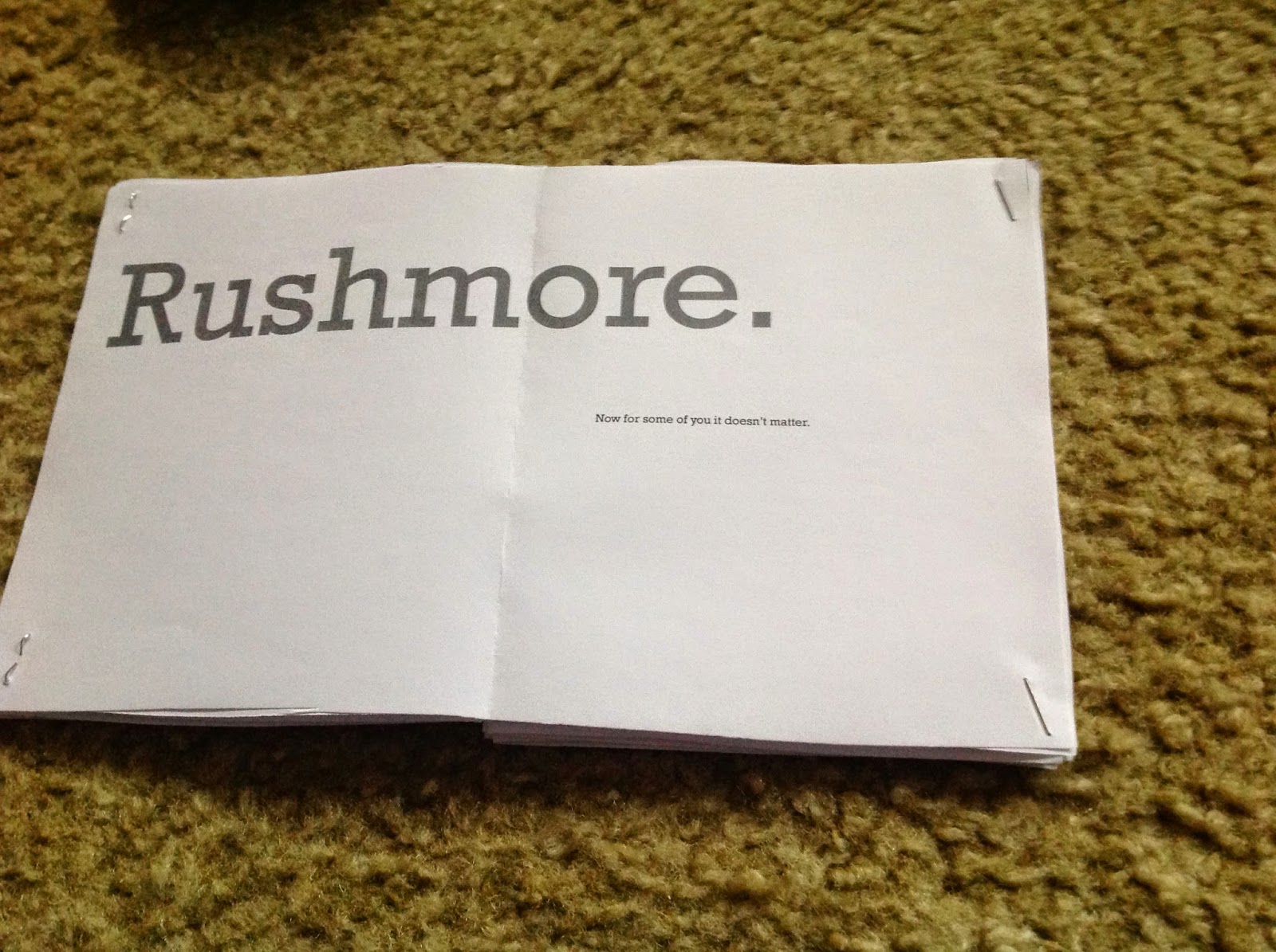


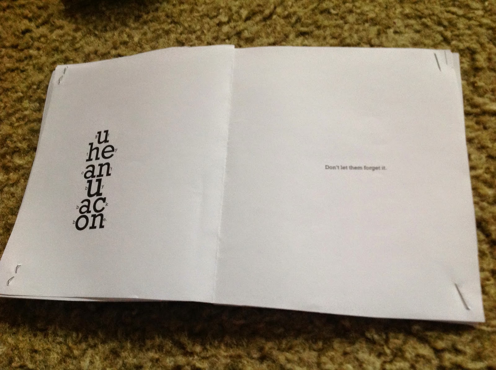

Here is the sorry monologue prototype I brought to class. People rightfully smirked at my garbage work. I was short on time due to life circumstances, but will be sure to complete a final copy.
Friday, October 10, 2014
Art 240, Week 6: Let's make a shirt! Then after you make it do a presentation that isn't that good because you are dumb.
All right, lets make a shirt!


Here are the materials I gathered. A dark purple shirt, a light pink shirt with a tinge of gray and some patches of fabric. (green, white, and black)
Here is the beginning of the spider. I decided to make his hair out of paper because the fabric I bought proved too difficult to cut accurately. The mouth is also made out of paper for the same reason. The body and eyes are make of thicker yarn. The legs proved difficult to cut out correctly and I kind of had to just freelance them. On the final spider I put him together a little bit too close together, but it's okay. I used hot glue to hold everything on the shirt together.

Here is the spider on the shirt I choose to see how it would look with the color composites.
 Here is a picture of the beginning of the web. I used thin fabric for these web strands.
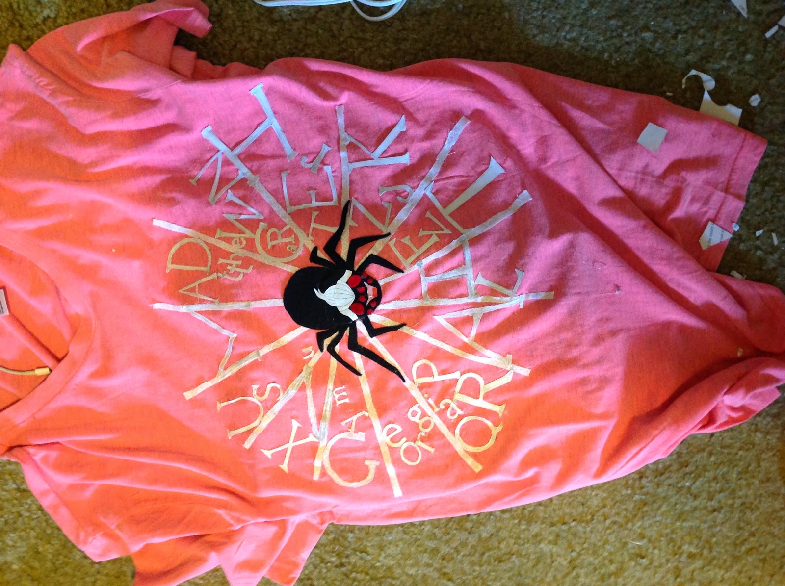 Here is the shirt with a lot of the text on it. I decided to use paper text because I waited til the last minute and the fabric was proving tricky to cut out properly. With paper I could quickly cut out the letters and have them look like the typeface they were to be representing.


Here is me wearing the shirt. I wanted to see how it looked. I added more letters on the web after this.
Another shirt picture. This time the spider and me have the same face. :D
 This is what my room looked like after all the cutting and hot gluing.
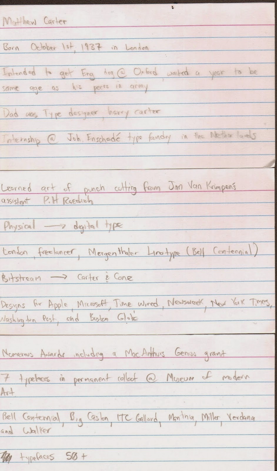 These are my note cards I used during my presentation. I completely misused my time and didn't make a powerpoint. Some people even wrote a paper, so I think I may have messed that up too. I posted my blog post to the google drive for the class and put some of these images there as well.
I think my shirt came out really nice. It had a neat mixed media feel to it. I think it wouldn't have came out as nice if I just had it printed, so that is a happy accident that came about because of me not staying on a tight schedule. I will post a better picture of it after Professor Mata takes one for her files. My presentation was lacking and I could have done a much better job. I'm not really giving some of the aspects of this class my all and that has to change if I want a better overall grade.
I hope I at least got a B overall on the assignment so I can salvage my total class grade in the upcoming 9 weeks of the class.
Here are the materials I gathered. A dark purple shirt, a light pink shirt with a tinge of gray and some patches of fabric. (green, white, and black)
Here is the beginning of the spider. I decided to make his hair out of paper because the fabric I bought proved too difficult to cut accurately. The mouth is also made out of paper for the same reason. The body and eyes are make of thicker yarn. The legs proved difficult to cut out correctly and I kind of had to just freelance them. On the final spider I put him together a little bit too close together, but it's okay. I used hot glue to hold everything on the shirt together.
Here is the spider on the shirt I choose to see how it would look with the color composites.
Here is me wearing the shirt. I wanted to see how it looked. I added more letters on the web after this.
Another shirt picture. This time the spider and me have the same face. :D
I think my shirt came out really nice. It had a neat mixed media feel to it. I think it wouldn't have came out as nice if I just had it printed, so that is a happy accident that came about because of me not staying on a tight schedule. I will post a better picture of it after Professor Mata takes one for her files. My presentation was lacking and I could have done a much better job. I'm not really giving some of the aspects of this class my all and that has to change if I want a better overall grade.
I hope I at least got a B overall on the assignment so I can salvage my total class grade in the upcoming 9 weeks of the class.
Art 240, Week 5: Hierarchy Project


Here are my pictures for my Hierarchy project. We were given a vague set of rules and then had to make signs for dance classes at the Kimmel Center. I thought I was going to be all creative and then about 10 minutes after the first one (which is at the bottom) I lost the will to complete the assignment and just made them all centered with different sizes.
We did a bad job as a class and were told to redo our ideas. I didn't use my time well and didn't do a second corrected set. I just handed my crappy first set in. I did not do well on this assignment.
Art 240, Week 4.1: Shirt Design Progress 2

Here is the sketch I brought to class for a progress critique. It got critiqued last and no one really said anything about it. I forgot to keep a crisp illustrator file so this is the image after I got my critique and I doodled on it so its a little rough. I wanted to use four colors, light gray, white, black, and red, and make a clean illustrator image.
Art 240, Week 4: Shirt Design Progress

This is the sketch I did for first pass on my T-Shirt Design. The spider is Matthew Carter, identified by his trademark white ponytail, on a web made of his font Georgia. This is because georgia was a font made for clarity on computer screens. You are reading it right now!
Tuesday, September 23, 2014
Art 240, Week 3.1: 50 Shirt Ideas
We were assigned to do 50 sketches for our T-Shirt project. Here they are posted late because I am a bad student. I chose the one with the cute spider.


Subscribe to:
Posts (Atom)