Hello everyone,
I meant to do this 3 weeks ago but have been delayed by a combination of busy-ness and laziness. Typography 1 is officially over and my final grade was a B+. I have no idea what I got on my animation project but I think I did a decent job. I still have no idea how to post it on here. It wasn't that mind blowing, so it's not like you missed out on an artistic goldmine.
The main reason I didn't get an A in the class was because I didn't study hard enough on an exam on text, which was literally an exam on shapes, so I guess I deserve my B+.
I have left Millersville University to support my girlfriend in North Carolina. She got a job teaching at a local elementary school, and when the cliche life decision of staying in a relationship or letting it fall apart from long distance came, I took the leap and moved to the South.
I enjoyed my time at Millersville and will think of it fondly. The campus was close to home, quiet, and cheap (not cheap in the bad way, MU had great facilities). There weren't any professors I didn't like and classes weren't that difficult. I will appreciate how the school helped me back on track to obtaining a degree. I hope to transfer to a college here in the fall to finish my higher education.
I got a B+ in my only other art class as well (Drawing 1) and could have gotten easily A's if I put in more effort. Working full time (at strange hours) and going to school full time was a bit rough, but I am sure lots of other students are doing the same thing so it's not much of an excuse. I also had a stupid group project in another class with a group of business majors that had to have their hands held through everything that ate up a bunch of potential art time. Hopefully I can learn a lot about time management from these experiences and make sure I don't repeat the same mistakes of putting my art work off til the last minute because it comes easier to me. I shouldn't be getting A's in my non art classes and B's in my actual major, I am doing it backwards. You are a dodo, Mike.
Professor Mata was pretty nice and class usually went smoothly. It was nice to dip my feet into Illustrator and other Adobe programs for the first time.
I will miss my classmates, but no one ever checks any of these blogs so I am sure no one will read this anyway. It made me a bit sad that my peers thought it was "creepy" that I was checking their blogs to see what work they were doing. I wanted to be good at this with what limited time I had so I tried to use what they were doing as inspiration. The only other student that really kept up with his blog was James, and he did maybe the best work in class so that was good to see. I enjoyed his short company and should have said goodbye to him properly. You can keep the Scott Pilgrim set James, I don't need it anymore. I hope a bright career in art is ahead of him.
These were my first real art classes on a college level and I think the thing I took most from them was how to interact with other artists. It seemed like no one wanted to hear how their work was bad which is an integral part of improvement. I wasn't perfect at reacting to criticisms from Professor Mata myself, but I felt like I was okay at coming to terms with that she doesn't want anyone to do bad and was only trying to help us. I personally think a lot of art is subjective and silly, but that doesn't mean I don't want to be good at it. I still have a lot of room for individual improvement and need to make sure I keep practicing and pushing myself to realize what potential I may have.
I will miss the rest of my back row pals (Gaby, Kylee, Andrew, James, and Shane), Jarren, Ty, Roy, Julie, Noah, and the tiny Australian girl. I wish them all the best in both their lives and artistic careers.
If anyone was following this blog from that blog robot thing here is my own art blog that I am going to try to resume updating once a week again.
http://michaelpfeffer.blogspot.com/
I will have actually been trying to put together a picture for a little art contest where I win nothing for fun, so lets see if I can keep up drawing daily.
Goodbye Typography blog, we had a good run.
Showing posts with label Typography 1. Show all posts
Showing posts with label Typography 1. Show all posts
Monday, January 12, 2015

Wednesday, November 26, 2014
Art 240: Week 15, Just more animation work, some inspiration
So yeah, I tried to post my animation here last week and failed. There is a way to get it posted via code, but I am just too dumb to do so. I am about 70 percent done right now and only have like 4 more sentences to go.
The professor wanted some inspiration for the book and animation of said book, but all I really had was a look I was thinking of which was basically from the movies themselves...

Wes Anderson makes heavy use of Futura in all of his movies. Well why didn't you use Futura, Michael? I have to pay for that to use it at home, so I just chose a typeface that looked a lot like it in Rockwell.
For my animation Rockwell wasn't available, so I picked Argo which is a good look a like.
I really just wanted to keep my animation as close to my book as possible. There were somethings I decided to just chop out because it won't work animated (or it could work, but it would take a lot of time, which is at a premium for me right now). A lot of my book was taking the text into pieces and trying to use to make the pages look like art. I both failed and succeeded in places while doing this, but to do it with the animation would again, take a lot of time to do right.
So I decided that my first goal would to be to just finish the animation and make it as clear and readable as possible.
Here is an example of my work in progress. I'm not trying to make anything crazy right now. Lots of plain stuff, fade ins, fade outs, stuff moving in, moving out, just trying to get the animation finished.
I didn't do any thumbnails, I kinda just went in and winged it. For my final few slides I am just going to stick to the formula that's worked so far and KISS ( keep it simple stupid).
We only have one class this week, so now its time for Thanksgiving. Hurray! I will post more influence'y stuff up next week. We'll just be having two more work days so maybe I can fail at putting up the animation again.

Wes Anderson makes heavy use of Futura in all of his movies. Well why didn't you use Futura, Michael? I have to pay for that to use it at home, so I just chose a typeface that looked a lot like it in Rockwell.
For my animation Rockwell wasn't available, so I picked Argo which is a good look a like.
I really just wanted to keep my animation as close to my book as possible. There were somethings I decided to just chop out because it won't work animated (or it could work, but it would take a lot of time, which is at a premium for me right now). A lot of my book was taking the text into pieces and trying to use to make the pages look like art. I both failed and succeeded in places while doing this, but to do it with the animation would again, take a lot of time to do right.
So I decided that my first goal would to be to just finish the animation and make it as clear and readable as possible.


Here is an example of my work in progress. I'm not trying to make anything crazy right now. Lots of plain stuff, fade ins, fade outs, stuff moving in, moving out, just trying to get the animation finished.
I didn't do any thumbnails, I kinda just went in and winged it. For my final few slides I am just going to stick to the formula that's worked so far and KISS ( keep it simple stupid).
We only have one class this week, so now its time for Thanksgiving. Hurray! I will post more influence'y stuff up next week. We'll just be having two more work days so maybe I can fail at putting up the animation again.
Saturday, November 22, 2014
Art 240, Week 14: Sharpening our Edge

This week we are learning how to use Adobe Edge CC to animate our monologue pages.
As a class we went over some basic tutorials to get ourselves started. Like many new things it seemed hard and unnecessary simply because it was new. But after a bit of time you learn the program is actually intuitive and fun to use. It just takes some trial and error to get the words to do what you want to do.
It's important to realize that you can't do some things you did when it was static, but there are all sorts of new things you can with the animations that you couldn't do with a still book.
We have to have about 85% of our project finished by Tuesday next week so I want to do a basic layout by then so I can learn what I have to add to the finished project.
I am trying not to complicate myself with a bunch of fancy blurs and what not because of time constraints. Hopefully with solid use of basic animation ideas I can make a good animation. Then with my remaining time I can gussy it up with fancy sparkles.
Thursday, November 13, 2014
Art 240, Week 13: Julie Press Monologue Book Critique


So we were assigned a classmates Monologue book to critique on our blog. I traded books with Ms. Julie Press because she tries hard and makes me want to be not cynical. She gave my book a nice critique and was right on a lot of points (some of my text wasn't clear as it could have been, I broke a rule or two, and some of my color choices could have been better). I think she thinks I am mad at her, nope, not mad at you Julie. You did a fine job.
Julie wanted a hard hitting critique because she wants to get better at Typography, and I like that, but I don't know how hard hitting I can be. One of the biggest problems I have with critiquing like this is that aside from just pointing out general design terms (stuff being balanced, clarity, general craftsmanship, basic ascetic things really ) there really isn't any concrete advice I can give her that's not just me saying "Well I would do it like this." I tried to make my book pop with lots of color and a bunch of activity, and while I succeeded in some ways I failed in others. Maybe my particular style choices won't mesh well with what Julie could be going for. Ultimately to get a good grade we just have to do what the professor wants, but sometimes I'm not really sure exactly what that is. With that being mentioned, lets just get to critiquing her work.
Julie's book was well made and I thought her new color scheme (originally it was blue and white) fit a beach theme well. She basically chose the colors of Argentina, but I don't think she did that on purpose. If she did do that on purpose and was being clever, I appreciate that. Julie followed all the project rules to a T. All the assigned aspects were included in a satisfactory manner.
Storytelling wise the text moves in a general direction and doesn't really get confusing at any point. Everything is easily readable and there aren't really any confusing points aside from where the two "NEVER"s are next to each other. The way your eye moves across the page it looks like it says "NEVER AND NEVER" for a second. That is the only real technical typography problem with the Julie's book I can find as everything else works just fine.
The only thing I would have done differently is spaced out that one big chunk of paragraph on the page that says "For mine, blah blah blah chunk on the right side." It's just a plain sentence that is centered on a blue background. I think Julie could have done something differently here, like maybe have used the whole spread page for the text chunk in a different way. Perhaps she could have curved them together so they resembled waves in the ocean /\/\/\/\/\/\ <===Like this maybe, but appropriately spaced out.
Overall Julie's book is successful and gets the job done, but may be a bit plain in some areas for my taste. This may not have much credo coming from someone who probably made his book too busy to its own detriment, but if Julie added a little bit of spice to some of her spreads she could have made her successful book that much better. She could have utilized more page space in some areas to offset some of the calmer spreads. Maybe Julie could have altered some of her text to to make it feel like the words on the page or put some of the sentences on a curve in some manner? I think despite differing on stylistic choices she did a fine job and should get at the very least a B for her work. Good job Julie, I hope the professor gives you an A.
Art 240, Week 13 My Monologue Book


So here is my finished Monologue book, hurray. I couldn't spend as much time on it as I would have wanted to so I made some mistakes. Lets list the mistakes in list form!
1. I didn't have enough time to shape the text into Texas so I just made a Texas shape and put the text into it. This is something we weren't allowed to do. Good job dummie
2. When I tried to make a crowd out of the words in spreads 3 and 4 why didn't I just make the beginning of each word orange instead of just making random words orange? Duh.
3. I could have made an actual crosshair out of an O and two T's instead of a big X. WHOOPS.
4. The backbone could have been made bigger and centered int he rectangle better.
5. I separated RUSHMORE into RUSH MORE for the cover for balance, but I think I could have just made it one word and it would have still worked.
6. There were some printer problems and I had to tape my cover to cardstock and the backcover got a little messed up. I will probably lose points for that, oh well.
That's about it, mistakes aside I like how the final product came out. I think if had more time (or used what little time I have better) I could have eventually corrected the mistakes and made a much nicer final product. Attached below is the video of the monologue I based my book on.
Wednesday, November 12, 2014
Art 240, Week 12: Crappy Monologue first draft


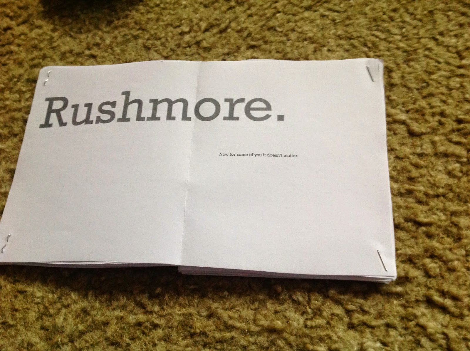


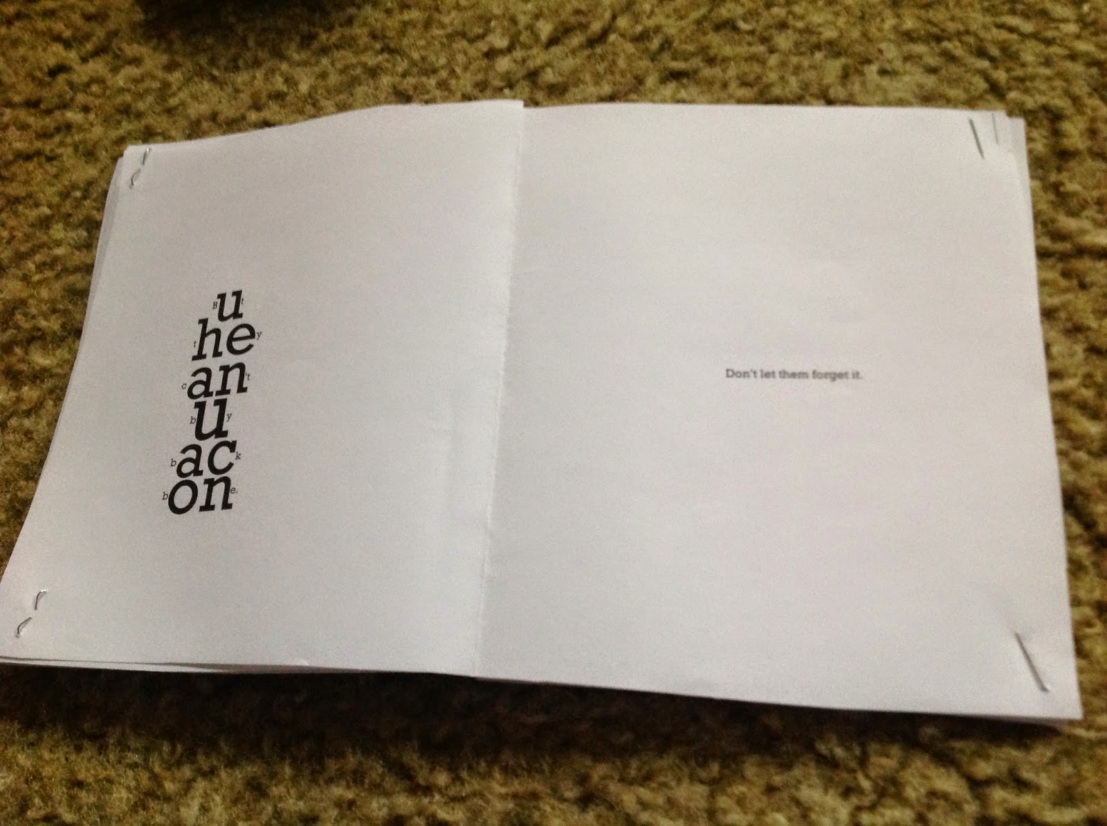

Here is the sorry monologue prototype I brought to class. People rightfully smirked at my garbage work. I was short on time due to life circumstances, but will be sure to complete a final copy.
Thursday, October 30, 2014
Art 240, Week 11: Kinetic Typography + Home Sick
Ira Glass Video
Rumble in The Jungle
The professor was in a car crash (thankfully she is okay) and couldn't make it to class today. I also didn't make it to class today because I was sick, (and didn't want to be the guy that make everyone else sick) but I can do the assignment we were given via email from home easily.
We had to watch a bunch of Kinetic Typography movies and pick which two we liked best and why.
http://www.designyourway.net/blog/inspiration/some-of-the-best-kinetic-typography-examples/
I picked the videos with Ira Glass talking about story telling and Muhammad Ali talking about the Rumble in The Jungle. I've linked them at the top of the post. While most of the videos were good, I chose these two because they appealed the most to me visually and phonetically.
Ira Glass: This video was successful in keeping pace with Ira Glass' verbal tics. I enjoyed how it switched up the pace when the dialogue was slow or fast. The typeface was clear and lent itself to Ira's signature annunciation. The various transitions were entertaining and never got so complicated that they took away from what you were reading. The background gave off a bookish feel which went well with the overall "storytelling" theme. The message of the video, while audio in nature, is also something that creative people can learn a lot from.
Rumble in The Jungle: This video was short, but it synced quite well with Ali's legendary rhythmic style of speech. The images (even though in our monologue project we aren't allowed use of them) worked together with the speech to make it even more interesting. The wiggling of the typeface gave visual feeling to the skill Ali had with a microphone. He was quite verbose and the constant movement matches well with the verbal dancing he was famed for. The wiggly movement also conveyed a feeling of the words being beaten down and hitting the canvas of a boxing ring.
Some runners up were the video about Futura's history (it was in French I think) and the It's Gonna be all right video with the sentence morphing.
Rumble in The Jungle
The professor was in a car crash (thankfully she is okay) and couldn't make it to class today. I also didn't make it to class today because I was sick, (and didn't want to be the guy that make everyone else sick) but I can do the assignment we were given via email from home easily.
We had to watch a bunch of Kinetic Typography movies and pick which two we liked best and why.
http://www.designyourway.net/blog/inspiration/some-of-the-best-kinetic-typography-examples/
I picked the videos with Ira Glass talking about story telling and Muhammad Ali talking about the Rumble in The Jungle. I've linked them at the top of the post. While most of the videos were good, I chose these two because they appealed the most to me visually and phonetically.
Ira Glass: This video was successful in keeping pace with Ira Glass' verbal tics. I enjoyed how it switched up the pace when the dialogue was slow or fast. The typeface was clear and lent itself to Ira's signature annunciation. The various transitions were entertaining and never got so complicated that they took away from what you were reading. The background gave off a bookish feel which went well with the overall "storytelling" theme. The message of the video, while audio in nature, is also something that creative people can learn a lot from.
Rumble in The Jungle: This video was short, but it synced quite well with Ali's legendary rhythmic style of speech. The images (even though in our monologue project we aren't allowed use of them) worked together with the speech to make it even more interesting. The wiggling of the typeface gave visual feeling to the skill Ali had with a microphone. He was quite verbose and the constant movement matches well with the verbal dancing he was famed for. The wiggly movement also conveyed a feeling of the words being beaten down and hitting the canvas of a boxing ring.
Some runners up were the video about Futura's history (it was in French I think) and the It's Gonna be all right video with the sentence morphing.
Tuesday, October 28, 2014
Art 240, Week 10.1: Monologue Thumbnails

Here are some rough thumbnails for my monologue project. They are all over the place. The professor gave some good advice on not being all cute all the time. You'll get sick of eating cake everyday, so sometimes a bland meal can balance that out.
Art 240, Week 10: Hierarchy Redo (thrice)


So we had to redo our hierarchy projects because we did bad as a class. The first picture is the one I did in class. We all did a bad job AGAIN, so we were assigned to do it one more time. The final picture is my fourth pass on the project. I wonder if we'll just keep doing them throughout the entire semester?
Below is the group of hierarchies I did for the second go round. I still don't know how to save them properly as JPEGs, they always crop weird. I was just too lazy to fix them so they look a bit weird in places.


Tuesday, October 14, 2014
Art 240, Week 9.1: Aaron Draplin Lecture Write Up OFF CAMPUS EVENT
Here is my write up of the lecture I went to on October 2nd at the Pennsylvania College of Art and Design.

Michael Pfeffer
Typography 1 Tu Th 3-5:3014
Professor Nancy Mata
Aaron Draplin: Tall Tales from a Large Man
14 Oct. 2014
I attended a lecture at the Pennsylvania College of Art and Design with my classmate Gaby Cohen. Several of our classmates and Professor Mata also attended. Gaby and I sat in the back and were anti social. I was in a semi grumpy grouch mood because I had projects for other classes due and was tired. Luckily the lecture was good and made me realize I was being a bit of a butthead. The lecturer was Aaron Draplin who is a successful graphic designer. I thought he was going to be a huge guy, but he was normal sized man who was just a bit overweight.
He was a positive guy who did clean, bold work. I related to him artistically (we share the same favorite font family, Futura) and I enjoyed all of his work. He talked to us about his life and how he bounced around the country while improving his draftsmanship. Through hard work and his own talent he managed to build his own personal design brand, DDC (Draplin Design Co.), with the mission of making good products for good people. The lecture was done in a simple manner, he just spoke with a powerpoint, but the content was engaging.
He was a positive guy who did clean, bold work. I related to him artistically (we share the same favorite font family, Futura) and I enjoyed all of his work. He talked to us about his life and how he bounced around the country while improving his draftsmanship. Through hard work and his own talent he managed to build his own personal design brand, DDC (Draplin Design Co.), with the mission of making good products for good people. The lecture was done in a simple manner, he just spoke with a powerpoint, but the content was engaging.
Mr. Draplin mainly pushed that if you believe in something and work hard you can make things that people will genuinely enjoy. I liked the laid back tone of the talk and the humor Aaron brought to his own story. You could tell he enjoys design and loves what he does. He showed how you can do good work and get paid, but still put a bit of your soul into it and make it your own. We were told entertaining stories about how he helped his friends with his design skills, situations he got into, and people he met while traveling the country. He values family highly and it was touching to hear him talk about how much he treasured his recently deceased father.
It was great to hear him speak about how excited he was to make a logo for President Barack Obama’s stimulus package. Sometimes I fear I am becoming a cynical jerk, and stories like this just remind me that doing things you enjoy are the reason to live life. At the end of the lecture he showed us pictures of himself with famous people which was good for some hearty laughs. The only part of the lecture I didn’t like was that it didn’t start on time, but what do you expect out of a talk from an artist? After he concluded his lecture he asked us to spend money on his merch in a polite way and everyone got to talk to him. Seeing how I was being a little wiener face, I didn’t go up and just buy a hat and some of his nice little notebooks like I should have. So I ordered a hat later online because I like to waste money on shipping, and make myself wait for things.
I didn’t really learn much from the lecture (I don’t mean that in a bad way, the lecture was good), as most creative types will tell you the best way to make stuff is to just start making stuff, and
that is what Aaron Draplin touched on here. I did find a new artist to be inspired by and buy things
from so that is always a positive. I am moving soon so I can use some nice grown up art to put in my
new place. The lecture also helped me realize to just be positive and try hard, and good things can
happy. I hope the second lecture I attend is as good as this one.
 |
| Here is a picture of me in my hat. USA #1 |
Art 240, Week 9 (I haven't been keeping track of the weeks correctly, now its fixed, yay): Monologue Project Begins
We were assigned a project where we have to take a monologue and use type to visually express what is being said. The first step is choosing which monologue we will visually manipulate.
I chose Herman Blume's (played by Bill Murray) opening speech from the movie Rushmore directed by Wes Anderson.

"You guys have it real easy.
I never had it like this where I grew up. But I send my kids here. Because the fact is: you go to one of the best schools in this country.
Rushmore.
Now for some of you it doesn't matter. You were born rich and you're going to stay rich. But here's my advice to the rest of you: take dead aim on the rich boys. Get them in the crosshairs. And take them down.
Just remember: they can buy anything. But they can't buy backbone. Don't let them forget it. Thank you. "
Alright, there we go, blog post finished. See you Thursday!
I chose Herman Blume's (played by Bill Murray) opening speech from the movie Rushmore directed by Wes Anderson.
"You guys have it real easy.
I never had it like this where I grew up. But I send my kids here. Because the fact is: you go to one of the best schools in this country.
Rushmore.
Now for some of you it doesn't matter. You were born rich and you're going to stay rich. But here's my advice to the rest of you: take dead aim on the rich boys. Get them in the crosshairs. And take them down.
Just remember: they can buy anything. But they can't buy backbone. Don't let them forget it. Thank you. "
Alright, there we go, blog post finished. See you Thursday!
Friday, October 10, 2014
Art 240, Week 6: Let's make a shirt! Then after you make it do a presentation that isn't that good because you are dumb.
All right, lets make a shirt!


Here are the materials I gathered. A dark purple shirt, a light pink shirt with a tinge of gray and some patches of fabric. (green, white, and black)
Here is the beginning of the spider. I decided to make his hair out of paper because the fabric I bought proved too difficult to cut accurately. The mouth is also made out of paper for the same reason. The body and eyes are make of thicker yarn. The legs proved difficult to cut out correctly and I kind of had to just freelance them. On the final spider I put him together a little bit too close together, but it's okay. I used hot glue to hold everything on the shirt together.

Here is the spider on the shirt I choose to see how it would look with the color composites.
.JPG) Here is a picture of the beginning of the web. I used thin fabric for these web strands.
Here is a picture of the beginning of the web. I used thin fabric for these web strands.
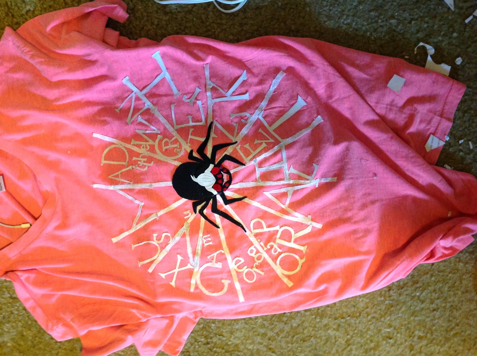 Here is the shirt with a lot of the text on it. I decided to use paper text because I waited til the last minute and the fabric was proving tricky to cut out properly. With paper I could quickly cut out the letters and have them look like the typeface they were to be representing.
.JPG)

Here is me wearing the shirt. I wanted to see how it looked. I added more letters on the web after this.
Another shirt picture. This time the spider and me have the same face. :D
 This is what my room looked like after all the cutting and hot gluing.
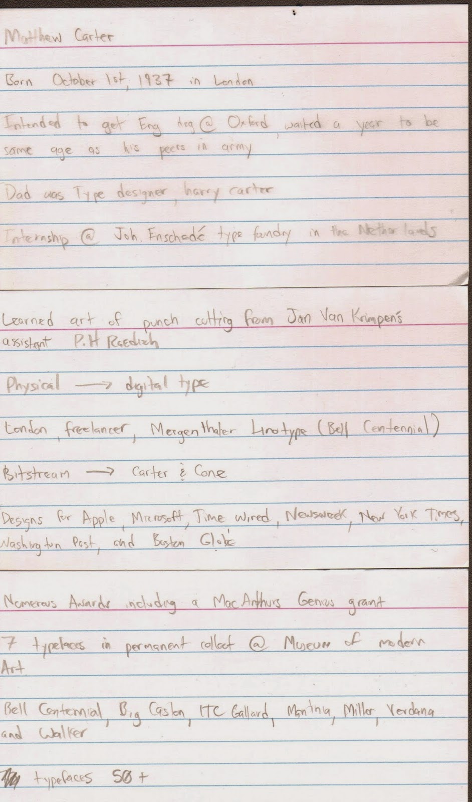 These are my note cards I used during my presentation. I completely misused my time and didn't make a powerpoint. Some people even wrote a paper, so I think I may have messed that up too. I posted my blog post to the google drive for the class and put some of these images there as well.
I think my shirt came out really nice. It had a neat mixed media feel to it. I think it wouldn't have came out as nice if I just had it printed, so that is a happy accident that came about because of me not staying on a tight schedule. I will post a better picture of it after Professor Mata takes one for her files. My presentation was lacking and I could have done a much better job. I'm not really giving some of the aspects of this class my all and that has to change if I want a better overall grade.
I hope I at least got a B overall on the assignment so I can salvage my total class grade in the upcoming 9 weeks of the class.
Here are the materials I gathered. A dark purple shirt, a light pink shirt with a tinge of gray and some patches of fabric. (green, white, and black)
Here is the beginning of the spider. I decided to make his hair out of paper because the fabric I bought proved too difficult to cut accurately. The mouth is also made out of paper for the same reason. The body and eyes are make of thicker yarn. The legs proved difficult to cut out correctly and I kind of had to just freelance them. On the final spider I put him together a little bit too close together, but it's okay. I used hot glue to hold everything on the shirt together.
Here is the spider on the shirt I choose to see how it would look with the color composites.
Here is me wearing the shirt. I wanted to see how it looked. I added more letters on the web after this.
Another shirt picture. This time the spider and me have the same face. :D
I think my shirt came out really nice. It had a neat mixed media feel to it. I think it wouldn't have came out as nice if I just had it printed, so that is a happy accident that came about because of me not staying on a tight schedule. I will post a better picture of it after Professor Mata takes one for her files. My presentation was lacking and I could have done a much better job. I'm not really giving some of the aspects of this class my all and that has to change if I want a better overall grade.
I hope I at least got a B overall on the assignment so I can salvage my total class grade in the upcoming 9 weeks of the class.
Subscribe to:
Posts (Atom)