Showing posts with label Typographic Elvis. Show all posts

Friday, October 10, 2014

Art 240, Week 6: Let's make a shirt! Then after you make it do a presentation that isn't that good because you are dumb.

All right, lets make a shirt!


     Here are the materials I gathered. A dark purple shirt, a light pink shirt with a tinge of gray and some patches of fabric. (green, white, and black)


     Here is the beginning of the spider. I decided to make his hair out of paper because the fabric I bought proved too difficult to cut accurately. The mouth is also made out of paper for the same reason. The body and eyes are make of thicker yarn. The legs proved difficult to cut out correctly and I kind of had to just freelance them. On the final spider I put him together a little bit too close together, but it's okay. I used hot glue to hold everything on the shirt together.

     Here is the spider on the shirt I choose to see how it would look with the color composites.

     Here is a picture of the beginning of the web. I used thin fabric for these web strands.

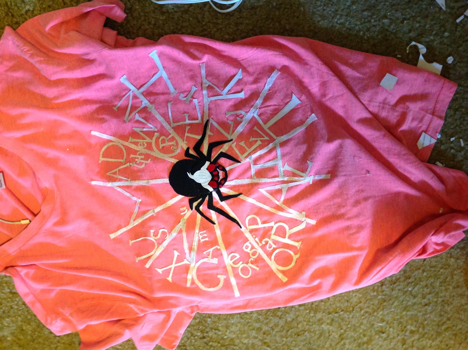
     Here is the shirt with a lot of the text on it. I decided to use paper text because I waited til the last minute and the fabric was proving tricky to cut out properly. With paper I could quickly cut out the letters and have them look like the typeface they were to be representing.

     Here is me wearing the shirt. I wanted to see how it looked. I added more letters on the web after this.


     Another shirt picture. This time the spider and me have the same face. :D


     This is what my room looked like after all the cutting and hot gluing.

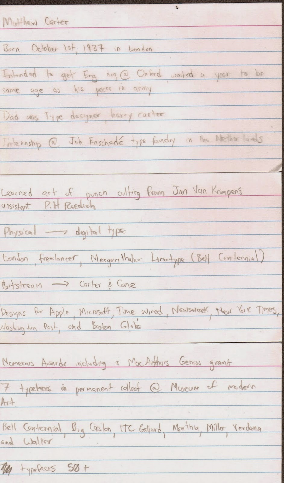
     These are my note cards I used during my presentation. I completely misused my time and didn't make a powerpoint. Some people even wrote a paper, so I think I may have messed that up too. I posted my blog post to the google drive for the class and put some of these images there as well.
     I think my shirt came out really nice. It had a neat mixed media feel to it. I think it wouldn't have came out as nice if I just had it printed, so that is a happy accident that came about because of me not staying on a tight schedule. I will post a better picture of it after Professor Mata takes one for her files. My presentation was lacking and I could have done a much better job. I'm not really giving some of the aspects of this class my all and that has to change if I want a better overall grade.
     I hope I at least got a B overall on the assignment so I can salvage my total class grade in the upcoming 9 weeks of the class.

Tuesday, September 16, 2014

Art 240, Week 3: Matthew Carter Shirt Design sketches


Here are some sketch ideas I came up with for our T-Shirt project. I have to make a shirt that has something to do with Matthew Carter that a "designer" would wear. What do designers wear? I don't know, hopefully my shirt?

Wednesday, September 10, 2014

Art 240, Week 2.1: Matthew Carter is apparently a big deal


This is Matthew Carter. He is a typographer and to other typographers he is very famous and important. Just think of him like the Typographic Elvis. He's a big deal.

He was born in 1937 in London. His dad, Harry Carter, was also a typographer, and helped nudge him into his career. When Matthew was going to enter college he was told to stay back a year so he could be the same age as his peers who were returning from the army. During this year off his father used his typographer connections to get him an internship at a printers in the Netherlands. Matthew used the skills he learned in the Netherlands to help him get his first freelance work in London.

While in London he begin designing typefaces which became quite well known. A good example of this work is the Bell Centennial font he designed for use in phone books. After some time in the industry he and some colleagues founded the company Bitstream Inc, which focused on designing digital type. He eventually left Bitstream with a partner to form Carter & Cone where he still works today. At Carter & Cone he gained much of his typography fame for designing the fonts Georgia and Verdana, which you probably use on a daily basis on your computer. In fact you are probably reading this very blog post on a font Matthew Carter himself made.

He's spent most of his later years having to sift through heaps of praise and sort through all the numerous awards he keeps winning. He is a senior critic in Yale's design program, and also won a MacArthur Genius grant in 2010 for his continuing contributions to type. Seven of his typefaces are actually in a permanent collection in the Museum of Modern Art in New York City. So aside from being the typographers typographer and having his work used by millions on a daily basis, I guess he's had a pretty good career.

Here are some links I used to find information on Mr. Carter.

http://www.fastcodesign.com/1662385/typography-legend-matthew-carter-wins-500k-genius-grant
http://en.wikipedia.org/wiki/Matthew_Carter
http://www.ted.com/talks/matthew_carter_my_life_in_typefaces
http://en.wikipedia.org/wiki/Carter_%26_Cone
http://www.macfound.org/fellows/28/