Showing posts with label Fun Assignment. Show all posts

Wednesday, November 26, 2014

Art 240: Week 15, Just more animation work, some inspiration

So yeah, I tried to post my animation here last week and failed. There is a way to get it posted via code, but I am just too dumb to do so. I am about 70 percent done right now and only have like 4 more sentences to go. The professor wanted some inspiration for the book and animation of said book, but all I really had was a look I was thinking of which was basically from the movies themselves...


Wes Anderson makes heavy use of Futura in all of his movies. Well why didn't you use Futura, Michael? I have to pay for that to use it at home, so I just chose a typeface that looked a lot like it in Rockwell.

For my animation Rockwell wasn't available, so I picked Argo which is a good look a like.

I really just wanted to keep my animation as close to my book as possible. There were somethings I decided to just chop out because it won't work animated (or it could work, but it would take a lot of time, which is at a premium for me right now). A lot of my book was taking the text into pieces and trying to use to make the pages look like art. I both failed and succeeded in places while doing this, but to do it with the animation would again, take a lot of time to do right.

So I decided that my first goal would to be to just finish the animation and make it as clear and readable as possible.


Here is an example of my work in progress. I'm not trying to make anything crazy right now. Lots of plain stuff, fade ins, fade outs, stuff moving in, moving out, just trying to get the animation finished.

I didn't do any thumbnails, I kinda just went in and winged it. For my final few slides I am just going to stick to the formula that's worked so far and KISS ( keep it simple stupid).

We only have one class this week, so now its time for Thanksgiving. Hurray! I will post more influence'y stuff up next week. We'll just be having two more work days so maybe I can fail at putting up the animation again.


Friday, October 10, 2014

Art 240, Week 6: Let's make a shirt! Then after you make it do a presentation that isn't that good because you are dumb.

All right, lets make a shirt!


     Here are the materials I gathered. A dark purple shirt, a light pink shirt with a tinge of gray and some patches of fabric. (green, white, and black)


     Here is the beginning of the spider. I decided to make his hair out of paper because the fabric I bought proved too difficult to cut accurately. The mouth is also made out of paper for the same reason. The body and eyes are make of thicker yarn. The legs proved difficult to cut out correctly and I kind of had to just freelance them. On the final spider I put him together a little bit too close together, but it's okay. I used hot glue to hold everything on the shirt together.

     Here is the spider on the shirt I choose to see how it would look with the color composites.

     Here is a picture of the beginning of the web. I used thin fabric for these web strands.

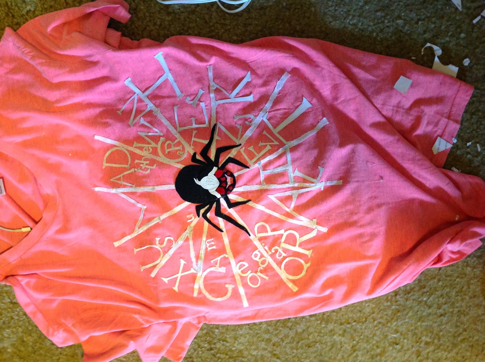
     Here is the shirt with a lot of the text on it. I decided to use paper text because I waited til the last minute and the fabric was proving tricky to cut out properly. With paper I could quickly cut out the letters and have them look like the typeface they were to be representing.

     Here is me wearing the shirt. I wanted to see how it looked. I added more letters on the web after this.


     Another shirt picture. This time the spider and me have the same face. :D


     This is what my room looked like after all the cutting and hot gluing.

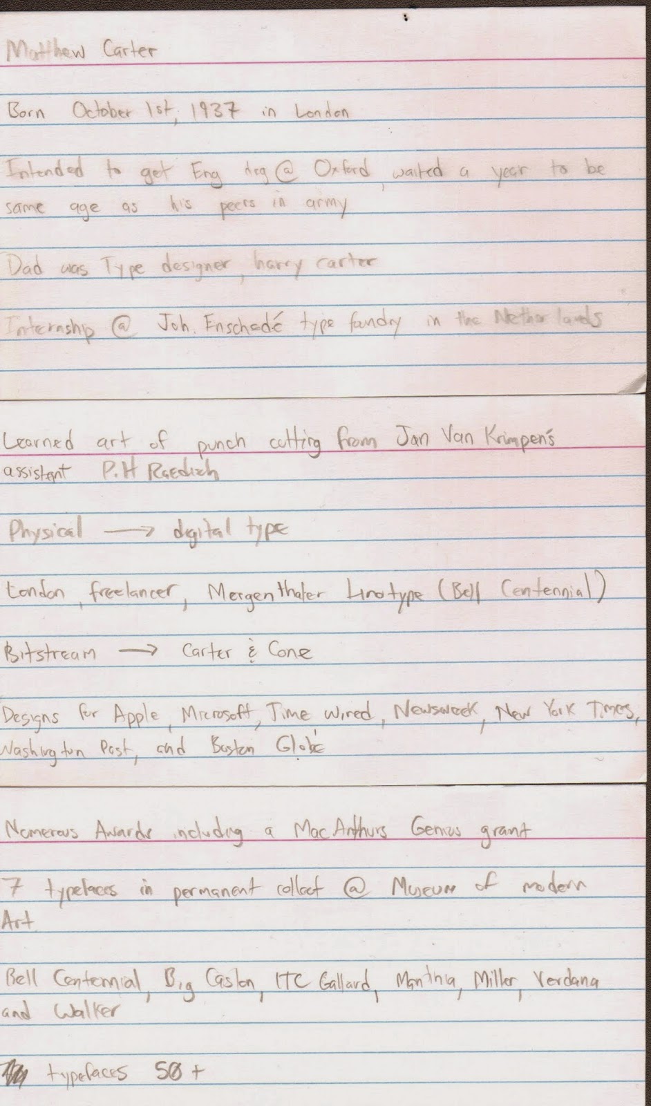
     These are my note cards I used during my presentation. I completely misused my time and didn't make a powerpoint. Some people even wrote a paper, so I think I may have messed that up too. I posted my blog post to the google drive for the class and put some of these images there as well.
     I think my shirt came out really nice. It had a neat mixed media feel to it. I think it wouldn't have came out as nice if I just had it printed, so that is a happy accident that came about because of me not staying on a tight schedule. I will post a better picture of it after Professor Mata takes one for her files. My presentation was lacking and I could have done a much better job. I'm not really giving some of the aspects of this class my all and that has to change if I want a better overall grade.
     I hope I at least got a B overall on the assignment so I can salvage my total class grade in the upcoming 9 weeks of the class.

Art 240, Week 4.1: Shirt Design Progress 2


Here is the sketch I brought to class for a progress critique. It got critiqued last and no one really said anything about it. I forgot to keep a crisp illustrator file so this is the image after I got my critique and I doodled on it so its a little rough. I wanted to use four colors, light gray, white, black, and red, and make a clean illustrator image. 

Art 240, Week 4: Shirt Design Progress


This is the sketch I did for first pass on my T-Shirt Design. The spider is Matthew Carter, identified by his trademark white ponytail, on a web made of his font Georgia. This is because georgia was a font made for clarity on computer screens. You are reading it right now! 

Tuesday, September 23, 2014

Art 240, Week 3.1: 50 Shirt Ideas

We were assigned to do 50 sketches for our T-Shirt project. Here they are posted late because I am a bad student. I chose the one with the cute spider.


Tuesday, September 16, 2014

Art 240, Week 3: Matthew Carter Shirt Design sketches


Here are some sketch ideas I came up with for our T-Shirt project. I have to make a shirt that has something to do with Matthew Carter that a "designer" would wear. What do designers wear? I don't know, hopefully my shirt?

Tuesday, September 9, 2014

Art 240 Professor Mata, Week 2: Four Letter Word Project

We were given an assignment where we had to pick a four letter word and then write it however we pleased within a dotted template. We could only use black and white; and had to write the word in all UPPER CASE, all lower case, and one however we pleased.

I chose the word Kill, mainly because I liked the K and the straight lines of the L's. I hope my classmates don't think I am crazy.